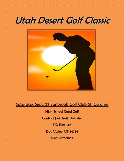
to do this project I opened word and typed the title. Then I inserted a picture of a golfer. I sized the picture to fit the page, and i gave it a border. Then I typed in the remaining information and changed the size so it would all fit onto the page. Finally i changed the colors of the borders on the page and picture and the color of the paper
Comments: 2
I really liked how you made the flyer come together with the bright orange color. Good job it looks really nice!
I think that you did a really good job on the contrast part. By having the bright orange color with the black it makes things pop out. I also think that you did good on the repetitoin because of how you used the same colors, black and orange, through out the enitre flyer. Awsome job on the alignment part. You made the paper look warm which fits into the whole dessert theme. Love the picture that you picked for the proximity part. I really ties in the desert theme of gold and with the warm colors in the background of the picture it fits in even more. This may have been your first flyer without knowing the CRAP Principles, but my gosh it is really good.
I really liked how you made the flyer come together with the bright orange color. Good job it looks really nice!
1/9/2012 11:06 AMBrooke Renee McGraw Reply
I think that you did a really good job on the contrast part. By having the bright orange color with the black it makes things pop out. I also think that you did good on the repetitoin because of how you used the same colors, black and orange, through out the enitre flyer. Awsome job on the alignment part. You made the paper look warm which fits into the whole dessert theme. Love the picture that you picked for the proximity part. I really ties in the desert theme of gold and with the warm colors in the background of the picture it fits in even more. This may have been your first flyer without knowing the CRAP Principles, but my gosh it is really good.
1/9/2012 11:19 AMBrooke Renee McGraw Reply